Use the Project Options dialog to do the following: Specify symbol property styles for shapes, paths, diagrams, and stereotypes within the project. For the instructions how to create, edit, clone, import /export, or remove symbol property styles, please refer to Style Engine. Change default element property values. For the instructions about setting the default element property values, please refer to Default Property Values. The Project Options dialog includes option groups, each designated for one of the above mentioned features and containing lists of corresponding options. Groups are represented using the tree structure. An option value can be simply changed by typing a new value, setting a value to true / false, or selecting a value from the list. Click the Reset to Defaults button to restore default option values. In order to change a desired project option, first of all you need to find it in the Project Options dialog. These options are grouped into categories to make it easier for you to locate them. Use the quick filter to find find the desired option in the list. Filtering is performed in the all available options, not only in the selected option group. Make sure that the Show Description mode is turned on in the Project Options dialog.
To open the Project Options dialog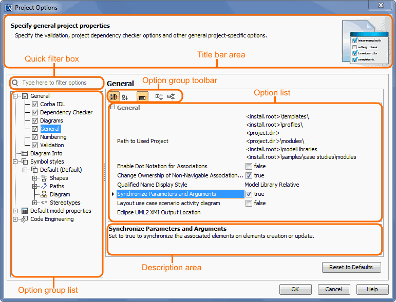
Changing options
To make sure you selected the right option, first read its description and see if the effect of changing the option value is what you expect to be done.
To turn the Show Description mode on or off, click the Show Description button on the following toolbar in the Project Options dialog.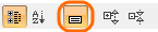
To read the option description
Project Options
The table below displays the default environment options. Additional options may appear based on installed plugins.
| Option | Default value | Value options | Description |
|---|---|---|---|
| General | |||
| Browser | |||
| Group Composite Instances | true | true/false | Set to true to show composite instances under their owning instances instead of the actual owning package in the Containment tree. |
| Corba IDL | |||
| CORBA Interfaces implemented as | UML Interface | UML Class UML Interface | Specify whether the CORBA Interfaces should be implemented as a UML Class or UML Interface. |
| Dependency Checker | |||
| Check for Cyclic Dependencies among Used Projects | false | true/false | Set to true to check for cyclic dependencies during the project export or package share. |
| Dependency Checker Severity Level | Info | Info Warning Error | Specify the dependency checker severity. The dependencies of the specified and higher severity will be displayed. |
| Ignore Standard/System Profiles | true | true/false | Set to true to exclude standard/system profiles when checking for cyclic dependencies in used projects. |
| Diagrams | |||
| Use i18n property for text rendering in the diagrams | true | true/false | Set to false to disable the i18n property. If the i18n property is set to false, all text symbols that are displayed in the diagram pane (for example, text which is displayed on the symbol) will not be distorted at any zoom ratio. |
| Display All Pins in Diagrams | true | true/false | Set to true to always display pin elements in the diagrams. Note: if this option is set to true and the pin symbol is deleted from the diagram, then the corresponding pin element will be deleted from the model, too. |
| Display All Activity Parameter Nodes in Diagrams | true | true/false | Set to true to always display activity parameter node elements in the diagrams. Note: if this option is set to true and the activity parameter node symbol is deleted from the diagram, then the corresponding activity parameter node element will be deleted from the model, too. |
| Use different Join/Fork and Decision/Merge notations | true | true/false | Use different notations to draw Join/Fork and Decision/Merge. |
| Diagram Context | Create Automatically | Create Automatically Do Not Create | A new diagram context element will be created automatically when the new diagram owned by a Package is created. This option is valid for all diagrams based on a Composite Structure Diagram. |
| Apply Image To | Type and Notify | Type and Notify Type Property | (This is personal property, meaning its value is unique for each user). Specify whether to apply an image to the property or its type when dragging or selecting an image from the Image Library or other resource. This option is available when the Type Selection Mode is switched on. |
| Use Aspects | false | true/false | Set to true to use definable diagram aspects in the project. |
| Ignored Aspects | - | multi-selection | Specify the aspects which should not be used in the project. |
| Suspend Auto-Resizing of Shapes | true | true/false | Set to true to keep the original size of shapes while editing the model by cutting text to fit inside the shape. You can use the Resize to Fit Content command (a small black square on the bottom line of the selected shape) to adjust the size of the shape to fit the content completely. |
| Suspend Auto-Displaying of Labels | true | true/false | Set to true if you do not want to automatically show labels on the diagram pane while editing the model. You can use the Show Suspended Labels command (a small black square on the selected path) to show suspended labels on the diagram pane. |
| Highlight Suspended Symbols | true | true/false | Set to true to highlight suspended symbols with not completely visible content. |
| Time Limit to Build Diagram | 60 | Real | Specify the maximum time (in seconds) allotted for diagram building while exporting a diagram. If the time limit is exceeded, the diagram is not exported. Set to 0 to export the diagram without the time limit. |
| Image Height Limit | 10000 | Real | Specify the maximum image height (in pixels) for diagram export. If the height limit is exceeded, the exported diagram is cropped, or the diagram is not exported at all, depending on the selected preference. Set to 0 to export the diagram without the image height limit. |
| Image Width Limit | 10000 | Real | Specify the maximum image width (in pixels) for diagram export. If the width limit is exceeded, the exported diagram is cropped, or the diagram is not exported at all, depending on the selected preference. Set to 0 to export the diagram without the image width limit. |
| Export Preference When Limits Exceeded | Export Cropped Diagram | Export Cropped Diagram Do Not Export | Specify the diagram export preference if the diagram image height and/or width limits are exceeded. |
| Element References | |||
| Default Element Hyperlink Text Display Mode | Name | Name Icon + Representation text Representation text Custom text | Specify how the hyperlink to the model element is displayed by default. Select 'Name' to display the element name from its Specification window. The 'Representation text' displays the full element title, visible in the Containment tree. Choose the 'Icon+Representation text' to display the element icon together with the full element title. Select 'Custom text' to type your own text. |
| Default Element Hyperlink Text Update Mode | Automatically updated | Automatically updated Automatically checked Manually checked Do not update | Specify when the hyperlink to the model element will be updated by default if the referenced element and the hyperlink become inconsistent. Select 'Automatically updated' to update hyperlink text or the referenced element name automatically. Choose 'Automatically checked' to enable active validation rules which check if the hyperlink and the referenced element are coherent. The 'Manually checked' option allows you to run validation manually, while the 'Do not update' option means that validation will not find any inconsistencies. |
| General | |||
| Path to Used Project | <project.dir> <install.root>\profiles <install.root>\modelLibraries | Custom | Specify the paths to store used projects and extension elements. |
| Enable Dot Notation for Associations | false | true/false | Set to true to use the dot notation for associations. If the dot notation is applied to an association, the association end is decorated with the dot if that end is owned by a classifier. The absence of the dot signifies ownership by the association. |
| Change Ownership of Non-Navigable Association End when Changing Navigability | true | true/false | Set to true to automatically change ownership of the non-navigable association end when the navigability of the association was changed. |
| Qualified Name Display Style | Model Library Relative | Absolute Model Relative Model Library Relative Model or Model Library Relative | Specify the mode of displaying the element qualified name. If the Model Library Relative mode is specified, it means that the element's full qualified name hierarchy is displayed on the shape, starting from the |
| Synchronize Parameters and Arguments | true | true/false | Set to true to synchronize the associated elements on elements creation or update. |
| Layout Template Creation Mode | Definition | Usage Definition | Specify the mode layout template diagram creation. Choose 'Definition' to create the layout templates as a class diagram. Choose 'Usage' to create the layout templates as a composite structure diagram. |
| Layout Use Case Scenario Activity Diagram | false | true/false | Set to true to automatically lay out the activity diagram of the use case scenario every time it is opened. |
| Decimal Places | 4 | Real | Specify the maximum number of decimal places to be used when displaying the real number in tables and element Specification windows. |
| Eclipse UML2 XMI Output Location | - | Custom | Specify the path to the location where the exported Eclipse UML2 XMI will be saved. |
| Use Glossary | true | true/false | Set to true to use the glossary functionality: mark terms in the text, create terms directly from the text, or reuse them in newly created texts. |
| Show Excel/CSV Import Migration Message | true | true/false | If true, the Migration message is shown each time when importing Excel/CSV mapping created with the CSV Import plugin. |
| Tooltips Style | Do Not Show | Do Not Show Show Element Name Show Element Documentation | (This is personal property, meaning its value is unique for each user). Specify the mode to display the element tooltip. |
| Legends | |||
| Filtering Preference | Show | Show Hide | Specify the default filtering preference for Legends. |
| Use Legends | true | true/false | Set to true to enable Legends adorning and filtering functionalities across all tables and diagrams with symbols in the project. |
| Ignored Legends | - | multi-selection | Specify the Legends which should not be used in the project. |
| Numbering | |||
| Use Element Auto-Number | false | true/false | Element auto-numbering option to control (turn off or turn on) element numbering functionality for the whole project. |
| Display Element Number | false | true/false | The 'Display Element Number' option allows to turn on or turn off the representation of the element number. |
| Lock Element Auto-Numbering | false | true/false | If set to true, the element auto-numbering is locked and cannot be changed. |
| Check Element Number Uniqueness Including all Properties | false | true/false | Set to true to include the main element number together with all internal element numbers into element uniqueness checking. |
| Check Element Number Uniqueness | true | true/false | Set to true to check element number uniqueness. |
| Check Element Number Uniqueness in: | - | multi-selection | Element number uniqueness options allow specifying where your element number should be unique. |
| Suspect Links | |||
| Enable Tracking | false | true/false | Set to true to start tracking suspect links. |
| Track Deprecated Elements | true | true/false | Set to true to track element deletions. |
| Track Links in main Project Only | true | true/false | Set to true to track suspect links in the main project only. |
| Tracking Scope | - | multi-selection | Select elements whose suspicions should be tracked. |
| Validation | |||
| Validation Scope | - | multi-selection | Specify the validation scope. The validation scope can be the entire model or some part of it. When the validation is run, each validation rule is evaluated for each suitable element in the validation scope. |
| Validate only Visible Diagrams | true | true/false | Set to true to validate only elements in one or more visible diagrams. |
| Exclude Elements from Used Read-Only Project | true | true/false | Set to true to exclude projects used in read-only mode and the elements that exist in these projects. Excluded projects will not be validated. |
| Mark in Tree and Diagrams | true | true/false | Set to true to highlight the invalid model elements in the browser with a small x symbol. The element symbol will be colored according to the severity level of the problem in the diagram. |
| Ignored Validation Suites | - | multi-selection | Specify the validation suites which should not be run during the model validation. |
| Ignored Validation Rules | - | multi-selection | Specify the validation rules which should not be run during the automatic model validation. |
| Minimal Severity | warning | debug info warning error fatal | Specify the minimal severity. When the validation is running, only the validation rules of the specified and the higher severity level will be run. |
| Composition Inspection | Standard | Standard Advanced | Select the level of composition inspection in your projects. The Standard inspection searches for issues only in the project, while the Advanced inspection, in addition to the Standard inspection, searches for issues in all the used projects. The inspection runs validation rules which validate the correctness of model integrity and project composition. |
| Detect Illegal Model References in Shared Projects | true | true/false | Set to true to check for illegal model references in projects. Illegal references are one of the main reasons why recovered elements appear in shared projects. |
| Ignored Validation Suites | - | multi-selection | Specify the validation suites which should not be run during the passive diagram validation. |
| Ignored Validation Rules | - | multi-selection | Specify the validation rules which should not be run during the passive diagram validation. |
| Minimal Severity | warning | debug info warning error fatal | Specify the minimal severity. When passive diagram validation is running, only the validation rules of the specified and the higher severity level will be run. |
| Diagram Info | |||
| Diagram information shows summarized data in each diagram, e.g. the author, creation and modification dates, etc. Choose the diagram tags in standard mode, their values should be shown in a predefined diagram information table, or choose how diagram information should e represented using the HTML code. | |||
| Symbol styles | |||
| Specify the shape, path, diagram, and stereotype symbol properties. Create, edit, clone, import/export, or remove element display styles. Also, set default styles or apply new styles to existing diagrams. | |||
| Default | |||
| Fill Color | RGB [255, 255, 204] | Custom | Change the fill color of the shape. |
| Use Fill Color | true | true/false | Shapes are colored on the diagram. |
| Pen Color | RGB [66, 66, 66] | Custom | Change the color of the path or lines around shapes. |
| Text Color | RGB [0, 0, 0] | Custom | Change the color of the text. |
| Line Width | 1 | Real | Specify the line width of the symbol. |
| Font | Arial 11 | multi-list | Change the font style of the text. |
| Show Number Tag Name | true | true/false | The option allows you to turn on or turn off the element number tag name on the symbol. |
| Element Number Display Mode | Before the element name | Above the element name Before the element name Do not display on symbol | The element number display mode option specifies the position on the symbol where the element number should be displayed. |
| Shapes | |||
| Fill Color | RGB [255, 255, 204] | Custom | Change the fill color of the shape. |
| Use Fill Color | true | true/false | Shapes are colored on the diagram. |
| Pen Color | RGB [66, 66, 66] | Custom | Change the color of the path or lines around shapes. |
| Text Color | RGB [0, 0, 0] | Custom | Change the color of the text. |
| Line Width | 1 | Real | Specify the line width of the symbol. |
| Font | Arial 11 | multi-list | Change the font style of the text. |
| Show Number Tag Name | true | true/false | The option allows you to turn on or turn off the element number tag name on the symbol. |
| Element Number Display Mode | Before the element name | Above the element name Before the element name Do not display on symbol | The element number display mode option specifies the position on the symbol where the element number should be displayed. |
| Autosize | false | true/false | Adjusts the size of a symbol to the contained information so that it uses minimum space. |
| Use Fixed Connection Points | false | true/false | When drawing a path between shapes, the end of the path is connected to the fixed point of the shape. |
| Suspend Auto-Resizing of Shape | Same as Diagram | Same as Diagram true false | Set to true to keep the original size of the selected shape while editing the model by cutting text to fit the shape. You can use the Resize to Fit Content command (a small black square on the bottom line of the selected shape) to adjust the size of the shape to fit the content completely. By default, the appropriate property defined for the diagram is used. |
| Suspend Auto-Displaying of Label | Same as Diagram | Same as Diagram true false | Set to true if you do not want to automatically show labels on the diagram pane while editing the model. You can use the Show Suspended labels command (a small black square on the selected path) to show suspended labels on the diagram pane. By default, the appropriate property defined for the diagram is used. |
| Label Orientation | Horizontal | Horizontal Vertical Automatic | Specify the orientation of the labels. Automatic label orientation will rotate labels of symbols according to the symbol orientation or edge orientation on which the symbol is placed. |
| Header in Bold | true | true/false | Shows the name of the symbol as bolded. |
| Text Vertical Position | Top | Top Center Bottom | Choose text and compartments' vertical position within the symbol. |
| Stereotype Color | RGB [0, 0, 0] | Custom | Change the color of the stereotype text label. |
| Stereotype Font | Arial 11 | multi-list | Change the font style of the stereotype text label. |
| Show Stereotypes | Text and Icon | Text and Icon Text Icon Shape Image and Text Shape Image Do Not Display | Display stereotypes on symbols. |
| Show DSL Stereotypes | All | All Only Last None | Specify whether to show all, none, or only the last of the DSL Stereotypes (stereotypes that have DSL customization with the option hideMetatype = true) on a symbol. |
| Show Constraints | true | true/false | Displays constraints on symbols. |
| Show Owner | Do Not Display | Do Not Display Below Element Name In Same Line With Name Above Element Name | Displays the name of the owner model element (beneath the corresponding model element name - old style notation, in the same line with the name, or above the element name). |
| Wrap Words | false | true/false | Wraps words to a new line when text exceeds textbox (name, constraint, tagged value, conveyed information, extension point, or provided and required interfaces) width. |
| Show Tagged Values | true | true/false | Displays tagged values on symbols. |
| Tagged Values and Constraints Horizontal Position | Right | Center Left Right | Choose the text alignment position of tagged values and constraints on the shape. |
| Constraint Text Mode | Expression | Name Expression Name and Expression | Choose the constraint name or expression to be displayed on the symbol. |
| Show Element Properties | false | true/false | Choose if the properties are displayed on the symbol of the element. |
| Show Icons in Compartments | true | true/false | Set to true to show the icon before the element name in the compartment. |
| Show Element Type in Compartments | false | true/false | Set to true to show the element type before its name when the icons are hidden in the compartment. |
| Show Derived Sign | false | true/false | Set to true to show the derived sign (/) before the element name in the Tagged Values compartment. |
| Paths | |||
| Fill Color | RGB [255, 255, 204] | Custom | Change the fill color of the shape. |
| Use Fill Color | true | true/false | Shapes are colored on the diagram. |
| Pen Color | RGB [66, 66, 66] | Custom | Change the color of the path or lines around shapes. |
| Text Color | RGB [0, 0, 0] | Custom | Change the color of the text. |
| Line Width | 1 | Real | Specify the line width of the symbol. |
| Font | Arial 11 | multi-list | Change the font style of the text. |
| Show Number Tag Name | true | true/false | The option allows you to turn on or turn off the element number tag name on the symbol. |
| Element Number Display Mode | Before the element name | Above the element name Before the element name Do not display on symbol | The element number display mode option specifies the position on the symbol where the element number should be displayed. |
| Path Style | Rectilinear | Rectilinear Oblique Bezier | Choose the style for the selected path. |
| Rounded Corners | false | true/false | Path breakpoints rounded or not. |
| Constraint Text Mode | Expression | Name Expression Name and Expression | Choose the constraint name or expression to be displayed on the symbol. |
| Suspend Auto-Resizing of Shape | Same as Diagram | Same as Diagram true false | Set to true to keep the original size of the selected shape while editing the model by cutting text to fit the shape. You can use the Resize to Fit Content command (a small black square on the bottom line of the selected shape) to adjust the size of the shape to fit the content completely. By default, the appropriate property defined for the diagram is used. |
| Suspend Auto-Displaying of Label | Same as Diagram | Same as Diagram true false | Set to true if you do not want to automatically show labels on the diagram pane while editing the model. You can use the Show Suspended labels command (a small black square on the selected path) to show suspended labels on the diagram pane. By default, the appropriate property defined for the diagram is used. |
| Label Orientation | Horizontal | Horizontal Vertical Automatic | Specify the orientation of labels. Automatic label orientation will rotate labels of symbols according to the symbol orientation or edge orientation on which the symbol is placed. |
| Diagram | |||
| Pen Color | RGB [66, 66, 66] | Custom | Change the color of the path or lines around shapes. |
| Text Color | RGB [0, 0, 0] | Custom | Change the color of the text. |
| Line Width | 1 | Real | Specify the line width of the symbol. |
| Font | Arial 11 | multi-list | Change the font style of the text. |
| Show Number Tag Name | true | true/false | The option allows you to turn on or turn off the element number tag name on the symbol. |
| Element Number Display Mode | Before the element name | Above the element name Before the element name Do not display on symbol | The element number display mode option specifies the position on the symbol where the element number should be displayed. |
| Background Color | RGB [255, 255, 255] | Custom | Change the color of the diagram background. |
| Use Gradient Fill | true | true/false | Use gradient for the shape color. |
| 3D Shadow | true | true/false | Display 3D shadow on shapes. |
| Show Grid | false | true/false | Displays gridlines on the diagram background. |
| Grid Size | 7 | 2-30 | Define the desired size for the gridlines. |
| Snap Paths to Grid | true | true/false | When moving paths, snap them to the grid. |
| Snap Shapes to Grid | true | true/false | When moving shapes, snap them to the grid. |
| Show Message Numbers | true | true/false | Show message numbers on the diagram. |
| Use Advanced Numbering | true | true/false | Use advanced numbering. |
| Show Activations | true | true/false | Display activation bars on lifelines in sequence diagrams. |
| Show Diagram Info | false | true/false | Display the table with the main information (name, author, creation and modification dates, etc.) about the diagram. |
| Show Owner | false | true/false | Displays diagram owner on the diagram tab. |
| Show Stereotypes | Text and Icon | Text and Icon Text Icon Shape Image and Text Shape Image Do Not Display | Display stereotypes on symbols. |
| Show DSL Stereotypes | All | All Only Last None | Specify whether to show all, none, or only the last of the DSL Stereotypes (stereotypes that have DSL customization with the option hideMetatype = true) on a symbol. |
| Use Stereotype | Diagram | Context Diagram | Use diagram stereotype or diagram context stereotype. |
| Stereotype Color | RGB [0, 0, 0] | Custom | Change the color of the stereotype text label. |
| Stereotype Font | Arial 11 | multi-list | Change the font style of the stereotype text label. |
| Diagram Orientation | Vertical | Vertical Horizontal | Set a diagram orientation mode. |
| Add Line Jumps To | Horizontal Line | None Horizontal Line Vertial Line | Specified how line jumps are added to intersections of links on the diagram. None - specifies that the diagram use no line jumps. Horizontal Line - specified that the line jumps appear only on horizontal lines. Vertical Line - specified that the line jumps appear only on the vertical lines. |
| Suspend Auto-Resizing of Shape | Same as Diagram | Same as Diagram true false | Set to true to keep the original size of the selected shape while editing the model by cutting text to fit the shape. You can use the Resize to Fit Content command (a small black square on the bottom line of the selected shape) to adjust the size of the shape to fit the content completely. By default, the appropriate property defined for the diagram is used. |
| Suspend Auto-Displaying of Label | Same as Diagram | Same as Diagram true false | Set to true if you do not want to automatically show labels on the diagram pane while editing the model. You can use the Show Suspended labels command (a small black square on the selected path) to show suspended labels on the diagram pane. By default, the appropriate property defined for the diagram is used. |
| Show Diagram Frame | true | true/false | Displays diagram frame on the diagram. |
| Show Abbreviated Type | false | true/false | Shows full/abbreviated diagram keyword type on the diagram frame header. |
| Show Diagram Name | true | true/false | The diagram name is displayed or hidden in the diagram frame header. |
| Show Diagram Type | false | true/false | The diagram kind is displayed or hidden in the diagram frame header. |
| Show Parameters | true | true/false | The diagram context element parameters (if there are any) are displayed in the diagram frame header. |
| Show Context Name | true | true/false | The diagram context element name is displayed or hidden in the diagram frame header. |
| Show Context Type | false | true/false | The diagram context element type is displayed or hidden in the diagram frame header. |
| Show Context Kind | true | true/false | The context kind is a keyword predefined in UML (e.g., package, class, activity). |
| Autosize | false | true/false | Adjusts the size of a symbol to the contained information so that it uses minimum space. |
| Aspect Ratio | Unspecified | Unspecified 1:1 4:3 3:4 16:9 9:16 A4 Landscape A4 Portrait US Letter Landscape US Letter Portrait | Choose the diagram frame aspect ratio from the list or define a new one. the format of your defined aspect ratio should be 'W:H'. |
| Use Rounded Corners | true | true/false | Use rounded corners on the diagram frame. Diagram frames in Activity and State Machine diagrams can be represented as rounded rectangles. |
| Suspend Auto-Resizing of Shapes | Same as Diagram | Same as Diagram true false | Set to true to keep the original size of shapes while editing the model by cutting text to fit inside the shape. You can use the Resize to Fit Content command (a small black square on the bottom line of the selected shape) to adjust the size of the shape to fit the content completely. |
| Stereotypes | |||
| Create elements' properties by stereotype. These properties will be applied when the symbol of the stereotyped element is created on the diagram pane. | |||
| Default model properties | |||
| In the Default model properties tab, select an element and change its default property values (the element will have these values after its creation). To change the default value only for a specific diagram, go to Diagrams main menu / Customize and edit the selected element properties. | |||
| Code Engineering | |||
Set general code generation or code reversing options. Also, configure generated code formatting styles for the selected programming languages. Subcategories: Code Generation Reverse Java Language Options C++ Language Options CORBA IDL 3.0 Language Options | |||